Barry's blog
Some thoughts on life and technology
Microsoftie switches to a MacBook
Written on 09 March 2017 by Barry
As a software engineer that has worked almost exclusively with Microsoft technology (C#, .NET, Windows Server) and with occasional exposure to Linux environments - I’ve never refrained from having opinions about products that were not in my day-to-day workspace.
Many around me have had their moment of joy when I told them that I was given a MacBook Pro in my new job, and that we’re using Google G-Suite instead of Office and Exchange. The latter I’ll leave for a future post (as Google probably already knows).
Upon joining ThoughtWorks in my new job as a consultant, it was unavoidable to be given a company laptop - one of the many virtues available to few less than 20 years ago.
To be exact, we were handed crispy new MacBook Pro devices - yes, ‘the one with the touch bar?’ a fan would ask. Yes, ‘the one without a hard-escape key and function keys?’ a developer would ask.
In this post I’ll try to share my findings and honest opinions, being a Windows power user who switched to macOS Sierra. Forgive some of the links though, they count as intentional sarcasm. :-)
Impressions
Unboxing
Apple has set a high bar for the experience and design, as we all know with their ‘Designed in California’ and other catchphrases. I can’t help to admit thinking “let’s see about that”.
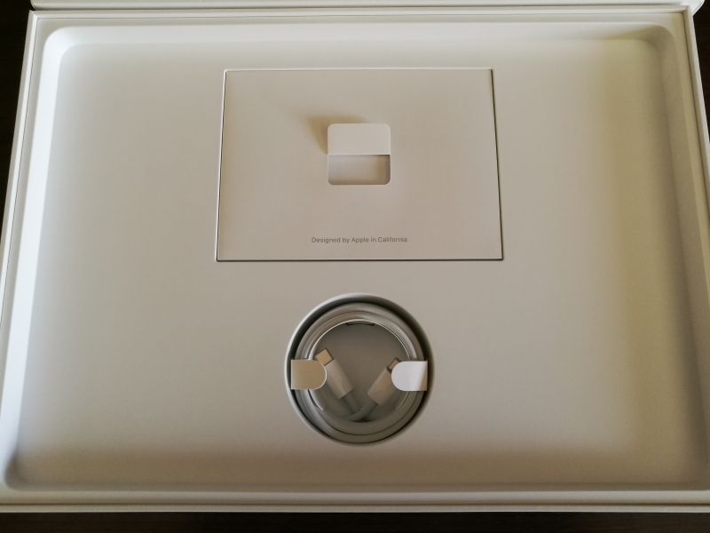
The box looks nice and feels sturdy, but one wonders why you can’t get the apple out of the box without flipping the whole box over. Was it such a design problem to add a little hole where you can get your finger underneath the device? The charge-only USB-C cable is nicely rolled up like a snake and placed under the device, but practically useless for other purposes. Putting that back after unrolling it, is virutally an impossible job. As there’s no other space or cavity in the box, you’re going to have to carry that around on your first day. The fact that this cable is USB-C makes it go in every port on either side of the device, allowing for better cable management in cramped workplaces and that is pleasant.
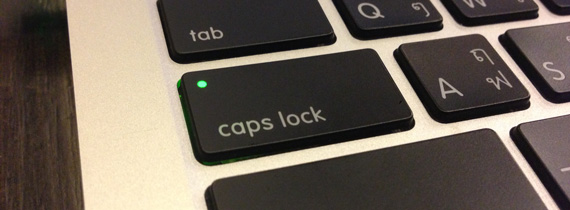
The keyboard is nice. It has a gentle click on start and end of a travel, but the return (enter) key could be horizontally aligned with shift, to reduce this annoying finger stretching. The keyboard backlighting looks smooth, but there was no budget left to give the Caps-lock key the same backlight colour when switched on - or something more tasteful.
Starting up
The OOBE is nice. There was no tasteful start-up sound and the first touch on the touchpad is soft and smooth the way only MacBooks have achieved so far. After setting up my account I expect to click on my profile picture to enter the password. Wrong. Apple’s design talent has decided that you need to explicitly click on your name underneath, in order to show the password box. When a first attempt at my password failed as I only typed on this new keyboard for the first time, I was already annoyed by the ‘no-shaking’ input box. Tastes differ, especially in design, but I felt childishly patronised by this form of skeuomorphism.
Mac Explor… eh, Finder
Power user or not, Windows users are wired to do their Ctrl+X for cutting, Ctrl+C for copying and Ctrl+V for pasting. Following the basic rule that the Command ⌘-key usually replaces the Ctrl key, I was surprised that cutting and pasting files resulted in duplicates. Apparently, when pasting with the intention to move a file, the user must press the Option ⌥-key whilst command-v’ing. To make it even less confusing to the user, there is a Cut option in Finder’s edit-menu which is unavailable!
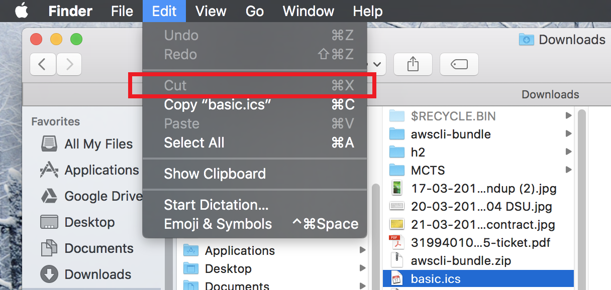 This menu item is only intended for usage with selected text
The inconsistency of having to copy a file with the intent of moving it when pasting, is logically incorrect.
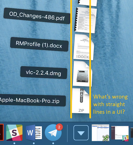
In search of other properly designed- and very basic user features, I studied the context menu that opens when two-finger-tapping (maclish for right-clicking) and was surprised by its structural and linguistic inconsistency. One of the first options is to ‘Move to trash’ - long wording for ‘remove’ or ‘delete’. Then after some separator we see ‘get info’ listed, which equates to Windows’ ‘File Properties’ dialog box. What follows is a handy ‘duplicate’ option with lesser used functions below it, to eventually arrive at ‘Copy [filename]’. Can anyone explain why the filename (or x items when multiple items are selected) is displayed here when that’s not the case for ‘open’, ‘get info’ or ‘rename’? Lastly, the ‘Quick look’ feature (also invoked by the space-bar) is a very fast way to preview files such as images, videos and PDFs, but unfortunately not supported by a lot of other formats - unrealised potential.
Connecting to a remote fileshare is easy and works very fast over SMB. Accessing my nas’ files and music works very smoothly and even quicker than Windows is able to connect at times. When you’re a power user though, with ‘hidden files’ set to be visible in Windows, expect to see .DS_Store files all over the place on your network and USB drives.
The Dock & desktops
The Command+space bar opens spotlight to quickly run a program. I like this as the Start Menu becomes tedious as it grows with programs. The spotlight even supports dictionary lookups, which can be very handy at times, avoiding a browse on the web or launching of an application. Without it however, you can resort to the launchpad (which is on the touch bar) or your dock-bar at the bottom of the screen. Or… open a finder window, navigate to applications and selecting the right application from there. (Don’t hit return though, that will rename a file instead of opening it!?)
Maximizing a window only seems possible when you want to put it into full-screen mode. Again, the Option key provides some relief, though it doesn’t work all the time. Closing a window is easy, but remember that unlike mobile devices, applications don’t close themselves. After you’ve closed the main window, the application itself may still be running - you can see this by the little ‘.’ under the icon in the Dock. Close that by Cmd+Q. Double work with little benefit on modern computers: application start-up time is usually fast enough, so there is no need to keep applications running.
Lastly, on the right hand side of that Dock, there is some separator that I don’t understand the use of. Some documents that are opened in an application show on the right, some application windows (such as Outlook reminders) show up on the right, some don’t show up at all. Oh, and the downloads folder is there, with some ugly-curved jump-list. I suspect it is up to app developers to make us of this space, which they haven’t done most of the time.
Multiple windows
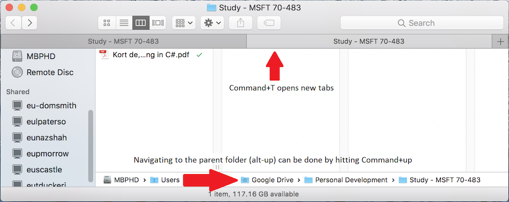
Windows logo key+tab, is the unmatched key combination that enables fast-window switching. It’s MacTernative Command+tab is a sheer productivity disappointment: it only allows switching between applications, not their windows. Within applications you’re left with hoping they’ve implemented a Ctrl+tab or Command+`` (backtick) feature, which may switch between tabs, the way Chrome does. Those tabs by the way, can be opened in a Finder window too, something Windows should’ve added years ago.
When working with multiple windows in the full-screen mode, the multiple-desktop experience is incredibly efficient. You can switch quickly and very smoothly between the different screens using a three-finger-swipe to the left or right. An overview of the windows is beautifully displayed with a three-finger-swipe up.
If you’re a keyboard person like myself, avoiding the mouse or touchpad has proven difficult. Navigating the multiple windows can be done by pressing Ctrl+up, but using arrow keys from there doesn’t work. This is a missed opportunity that should be easy to resolve in an update. Also, OSX lacks mnemonic keys and even developers struggle to implement them. All in all, keyboard navigation is a failed nightmare, indended to have the user caress their magic mice all the time, develop RSI and… and… but I doubt that’s because of the British layout:
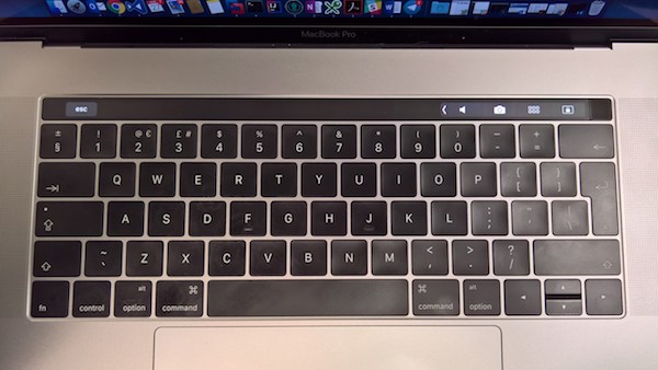 The MacBook Pro British English keyboard has a messy keymap with the §-key being a default. I’m not a lawyer.
Touch-bar
It is a nice idea, but that’s all. The touch bar hasn’t really proven itself to be useful for me yet, apart from the volume controls and lock-key. Nevertheless, the tendency to touch the screen when browsing the web makes the touch bar feel like a cheap alternative to building a fully touch capable device. Whilst coding, I miss the hard-escape key - despite it being displayed the majority of the time. I’ll leave it at, I don’t understand the hype around it.
When you’re working in a virtual machine with Windows, or running Windows applications where you’re used to the F1-F12 keys, be sure to enable the function keys for that application, so that they are always visible.
External devices
With my doubts about the ergonomics of Apple’s mice and keyboards I ordered a bluetooth mouse. Yes, a Microsoft one. Not because of the name, because I’m a fan of their economic design and their Bluetrack technology.
A basic issue is the scrolling: you cannot specify the touchpad to use natural-scrolling and use ‘regular’ scrolling for an external mouse. Effectively I have to get used to scrolling up to go down, on my mouse now. A large miss where Apple could’ve cared a bit more about other hardware. (At least there’s a tool for that.)
As the mouse is connected via Bluetooth (no regular USB ports anymore) I’m constantly faced with messages on the screen ‘mouse disconnected’ and ‘mouse connected’ when the bluetooth connection goes to sleep. Speaking of Bluetooth, when taking that picture of my keyboard above, I wasn’t able to send the file over and there is no option to ‘receive file’ under the teeth menu; I had to enable file transfer via System Preferences > Sharing. All insanely intuitive.
What with the missing headphone jack on the new iPhone, I’m very happy that the USB-C ports have not taken the place of a mini-jack, allowing me to plug in a normal headphone set and supporting the microphone right away. Knowing Apple, they might remove that port on the next model thougg, because it does so disturb the design indeed.
Charging this thing
Forgive the tone of the header, but I expect a computer not to behave like a phone or other thing with a battery. When OSX has died from a drained battery after failing to enter hibernate (sleep and persist RAM to disk) mode, I shall plug it in and want it to start up. However, due to an issue that’s been around for almost 10 years the battery first needs a bit of juice before the machine can boot up. After my first few days, this cost me some 20 minutes’ time. Just imagine having to give a presentation first thing in the morning.
Ending positively - conclusion
This post has mainly been a braindump of some first observations. My experience with VMWare Fusion, Chrome (which is nice and consistent across platforms), VS Code and the Terminal has so far made me quite productive and I’m very satisfied with the battery life that lasts almost a working day. The latter can potentially be longer, if I were to close my 50+ Chrome tabs, a Virtual Machine and various Docker containers.
Being a new user to Mac, I’d be happy to hear & share any feedback with tips or corrections on the above, that would make life easier for all of us.
To finish up, I have no doubt I can be productive and grow to like my new workflow. As the adage goes “Good soup and a warm kitchen are what make a house a home.” But as long as MacOS’ user experience is as messy as the new administration, my warm kitchen will remain to be the one with Windows in it.
Categories:
Work
Tags:
apple, mac, osx, and windows